The colors that build up every corner of your personal space, at the office or home, can affect your mood in more ways than one. Colors and emotions have an intricate dynamic that artists have only recently begun studying about. From the room color you choose for your walls down to the color you pick for your sofa, color psychology can either make or break your mood for the day.
That is because color has the power to change perspective. Color can change the shape and size of furnishings, as well as the shape and size of the room itself. Something as simple as shifting to lighter colors can make a room appear much more spacious than it seems. The trick is to blend color combinations that make you happiest since colors are a direct reflection of you as a person. Luckily, The Printerie understands color selections well enough to give you the three most versatile colors to use on your next furnishing activity.
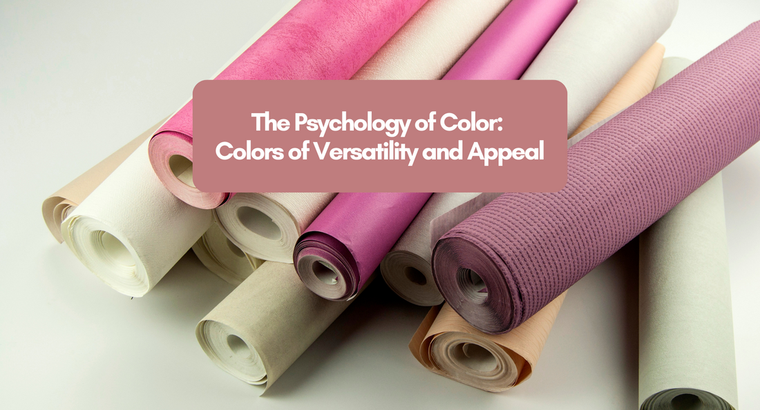
Tan and Beige
Decorating with Tan and Beige colors might not sound as appealing as you'd expect, but their versatility to pair with darker tones is a chef's kiss in elegance and sophistication. Tan and Beige are far from being eye-catching colors in the spectrum but has more to give with enhancing playful hues rather than just being your plain, dutiful 'default' for walls.

You can also use tan or beige to add more earthy, warm touches to your spaces, especially on furnishings or textural materials. The light brownish color gives a subtle drama to a room's schematics.

Blue
Although it is a color that reminds you of those sad days that passed, you got to admit that the color blue gives a sense of tranquility from time to time. Blue creates an atmosphere filled with lightness and purity—as such is the color of the sky and heavens.

Perhaps this is why most lighter shades of the color blue are utilized on bathroom or children's walls to give them an airier ambiance. The color blue's versatility shines best when the gradation of its shades pairs well with any style of interior. Like how shabby chics go well with blue pastels, and how lofts with Scandinavian interiors look structured under complex, muted shades.

Black and White
It goes without saying that the Classics are classics for a reason. What more can you say about this timeless combination of colors? Designers usually use the two-tone color scheme to wake-up interiors. More specifically, to give the room more flare and a lasting impression.
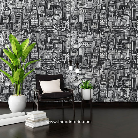
The beauty of using a black-and-white palette comes from its simplicity in application. It's as flexible as it can get depending on how you use it. It's advisable to distribute these colors equally so as not to let one overpower the other. However, some opt to embrace the concept of imbalance where black and white becomes relative depending on their undertones. This is to evoke a grounded look of refinement.

Although colors can be mixed and matched to what best complements them, keep your creativity in tact by not limiting yourself to what is conventionally appealing. In the end, the colors that make you most comfortable are the best colors there can ever be.
Explore more colors and designs for your next home or interior projects by visiting www.theprinterie.com or send us a message today.