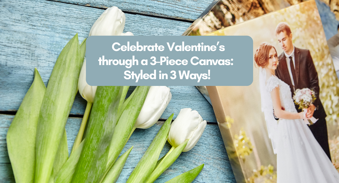
In a romantic relationship, ‘three’ is truly a crowd. But in terms of art & design, it’s always the number three that always perfects the look (like in the Rule of Thirds and the Triangle Principle). Three helps display balance, make emphasis and portray hierarchy. In fact, a three-piece wall art set hung together to tell one artistic story is known as a triptych. Only this time, the ‘one artistic story’ will be your love story.
Celebrate your story this Valentine’s with The Printerie by choosing three of your best photos together, having it printed by us on a quality canvas and gifting it to your special someone. We do offer free gift-wrapping and a greeting card for every package of three canvases this Valentine's!

1PC 8x8 = ₱400
3PCS 6x6 = ₱850
3PCS 8x8 = ₱1,155
Unlike floral bouquets that wither by time and boxes of chocolates that get eaten eventually, this 3-piece canvas set will definitely make for a thoughtful and timeless present between couples. Seeing this set on their walls everyday can always remind them of how beautiful their relationship is, despite the challenges of everyday life.
Now, the next question is: How do we (beautifully & strategically) display a three-piece gallery?---Here are three different looks we pulled-off with three canvas prints – take a look and let us know which one of these you’ve decided to be your peg!
#1 Look: The Horizontal Straight Line

Start by arranging your three-set canvas loosely on the table or on the floor, this way you get to see first which arrangement will work best before hammering it onto your walls.
For a horizontal straight-line orientation, the recommendation is to put the busiest photo (or the photo where the subject is the largest, or the photo with the most colors) in the middle.
But remember, there really is no right or wrong in finding the best order of photos. Our pro tip is when you think you’ve found the look, make sure to first take a photo of it to check how it looks, that maybe the naked eye would’ve missed!
#2 Look: The Asymmetrical Triangle

Asymmetry is as beautiful as symmetry. Style your wall like a pro using the Triangle Principle of interior design. This principle is a theory of setting up your images with the three points of a triangle in them. That triangle creates a frame of sorts within which you methodically lead the viewer’s eye to the ‘focal point.’
Start by choosing which one of the three photos will be your focal point, or your ‘main’ photo. Align the other two vertically, and the third (which is your main photo) centered on the side. This way the viewer gives a longer look at the main photo, which is the focal point, then onto the next two photos.
#3: The Pyramid Orientation

The Pyramid orientation starts with a single canvas on top of the two other canvases below side by side. This wall art blocking is more about the hierarchical structure—maximizing the wall space as it guides the viewer’s eyes from top to bottom.
Hanging it this way could be tricky as you have to work around the blocking of your furniture to make it look seamless and cohesive. A pro tip for this one is to center the whole wall display with the total width for the furniture under it. Unlike the Asymmetrical Triangle, if the pyramid isn’t strictly centered with the furniture, something will always look off.
Just remember that finding the right look is always a trial-and-error, so don’t forget to plan it out on the floor first before hanging it up. The good thing is that you’ll see that each canvas you get from The Printerie is made in high-quality materials and printing to guarantee a polished finish on your walls, regardless of the lighting. The Printerie also guarantees that all materials used are eco-friendly and safe. The materials and ink are UL GreenGuard Certified.
Please get in touch with us to help you with this wonderful Valentine’s gift that will celebrate your love story brilliantly in our products. You may shoot us an e-mail for samples at theprinterie.shop@gmail.com.

